Mood-Boosting Colours: How Warm Tones Affect Your Space

The colors we choose for our living spaces have a profound impact on our daily mood, energy levels, and overall well-being. Among the most powerful choices we can make are warm colors, which have the remarkable ability to transform any room into a welcoming, energizing sanctuary.
Understanding how warm colors influence our psychological state and learning to incorporate them effectively can revolutionize the way you experience your home.
Table of Contents
The Science Behind Warm Colors and Mood
Color psychology reveals that warm colors—including reds, oranges, yellows, and their various shades—trigger specific emotional and physiological responses in our brains. These warm colors are associated with sunlight, fire, and other natural sources of heat and energy, making them inherently comforting and stimulating to human perception.
Research in environmental psychology shows that warm colors can increase heart rate, boost metabolism, and enhance feelings of excitement and optimism. When we surround ourselves with warm colors, our brains interpret these visual cues as signals of safety, comfort, and vitality. This biological response explains why warm colors are so effective at creating inviting, mood-boosting environments.
The wavelengths of warm colors are longer than those of cool colors, making them appear to advance toward us visually. This characteristic makes warm colors feel more immediate and engaging, creating spaces that feel intimate and energizing rather than distant or cold.


Creating Energy with Red: The Most Powerful Warm Color


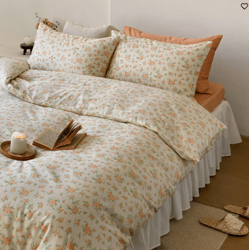
Red stands as the most intense and emotionally charged of all warm colors. This bold hue has the power to instantly energize a space and stimulate conversation, making it ideal for social areas like dining rooms and living spaces. The psychological impact of red is immediate and strong—it can increase appetite, raise energy levels, and create a sense of urgency or excitement.
However, using red effectively requires careful consideration. Deep, rich reds like burgundy or wine create sophisticated, cozy atmospheres perfect for intimate spaces, while brighter reds work well as accent colors rather than dominant hues. Consider incorporating red through throw pillows, artwork, or a single accent wall rather than overwhelming an entire room.
When working with red among your palette, balance is crucial. Too much red can create feelings of aggression or restlessness, while the right amount can invigorate and inspire. Pair red with neutral tones or other colours in smaller doses to create harmonious, mood-boosting environments.
Shop warm red bedding sets here...
Orange: The Social Butterfly of Warm Colors


Orange combines the energy of red with the cheerfulness of yellow, making it one of the most sociable and welcoming warm colors. This vibrant hue promotes feelings of enthusiasm, creativity, and social connection, making it particularly effective in spaces where people gather and interact.
The versatility of orange allows for numerous applications in interior design. Soft peach tones create gentle, nurturing environments perfect for bedrooms or reading nooks, while bold tangerine shades energize kitchens and dining areas. Burnt orange and terracotta bring earthy sophistication to living rooms and home offices.
Orange is particularly effective in spaces that lack natural light, as these warm colors can compensate for the absence of sunlight and create the illusion of warmth and brightness. Consider using orange accents in north-facing rooms or basement spaces to counteract the natural coolness and create more inviting environments.
Shop orange sets here...
Yellow: Sunshine in Your Living Space


Yellow, the brightest and most reflective of warm colors, brings instant sunshine and optimism to any space. This cheerful hue stimulates mental activity, enhances concentration, and promotes feelings of happiness and clarity. Yellow's association with sunlight makes it a natural mood booster, particularly effective in combating seasonal depression or creating uplifting environments.
The key to successfully incorporating yellow lies in choosing the right shade and application. Soft butter yellows create welcoming atmospheres without overwhelming the senses, while golden yellows add richness and elegance. Bright, pure yellows work best as accent colors, bringing energy and focus to specific areas without dominating the entire space.
Yellow works exceptionally well in kitchens, breakfast nooks, and home offices where mental alertness and positive energy are desired. These warm colors can make small spaces feel larger and darker rooms feel brighter, making yellow an excellent choice for challenging spaces that need mood-boosting intervention.
Shop yellow sets here...
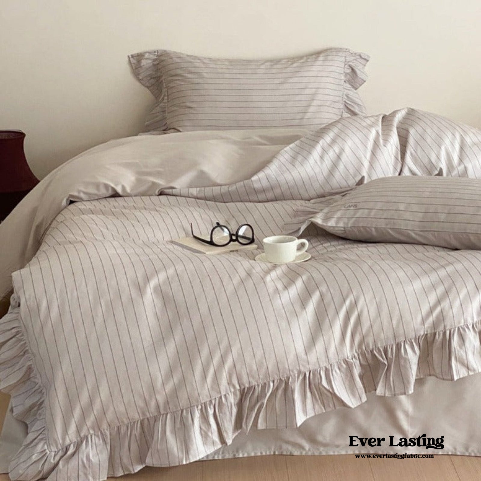
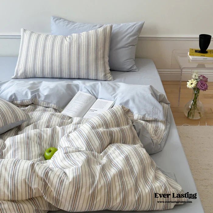
The Subtle Power of Warm Neutrals


Not all mood-boosting warm colors need to be bold or vibrant. Warm neutrals—including beiges, taupes, warm grays, and cream tones—provide the psychological benefits of warm colors while maintaining sophisticated, versatile aesthetics. These subtle colors create foundations that support well-being without overwhelming the senses.
Warm neutrals work by incorporating undertones of red, yellow, or orange that register subconsciously, providing the mood-boosting benefits of warm colors while appearing sophisticated and timeless. These colors are particularly valuable in bedrooms, where relaxation is important but some warmth is desired to prevent the space from feeling cold or unwelcoming.
The advantage of warm neutrals is their ability to serve as perfect backdrops for bolder colors. By establishing a foundation of warm neutrals, you can introduce pops of more vibrant warm colors through accessories, artwork, and textiles without creating overwhelming environments.
Achieve the same look with
Strategic Application: Where and How to Use Warm Colors


The effectiveness of warm colors depends significantly on strategic placement and application. Understanding which spaces benefit most from warm colors ensures maximum mood-boosting impact while maintaining overall design harmony.
Living rooms and family rooms are ideal candidates for warm colors, as these spaces benefit from the social, energizing qualities these hues provide. Consider warm colors for accent walls, major furniture pieces, or through layered accessories and textiles.
Dining rooms particularly benefit from warm colors, as these hues stimulate appetite and encourage lingering conversation. The intimate, cozy feeling created by warm colors makes meal times more enjoyable and social gatherings more successful.
Kitchens can be transformed with warm colors, particularly through backsplashes, cabinet colors, or decorative elements. The energizing quality of warm colors supports the active, creative nature of cooking while creating welcoming spaces for family interaction.
Home offices and creative spaces benefit from the stimulating properties of warm colors, particularly yellows and oranges that enhance mental clarity and creative thinking. Use warm colors strategically to create inspiring, productive environments.
Achieve the same look with
Conclusion: Transforming Your Space with Intentional Color Choices
The power of warm colors to influence mood and energy levels makes them invaluable tools in creating homes that support well-being and happiness. By understanding the psychological impact of these hues and applying them strategically throughout your living spaces, you can create environments that naturally boost mood, encourage social connection, and provide the comfort and energy needed for daily life.
Whether you choose to embrace bold, vibrant warm colors or prefer the subtle influence of warm neutrals, the key lies in intentional application and thoughtful balance. Your home should reflect your personality while supporting your emotional and psychological needs, and warm colors provide the perfect foundation for creating such transformative spaces.
Remember that the most effective use of warm colors comes from understanding your own responses to different hues and creating personalized combinations that truly enhance your daily experience. Start small with accessories and accent pieces, then gradually incorporate more warm colors as you discover what works best for your lifestyle and aesthetic preferences.
Find more inspiration in our other blogs:


Quick Bedding FAQ:
What size should I get?
In terms of sizing, most college dorms have Twin XL beds. In that case, we recommend going with a small size bed set and flat sheet. If you're looking for a fresh start or not sure where to begin, we recommend checking out our bundles! Each bundle will include a pillow, duvet insert and bedding set! It is also already pre discounted! Say heyyy to savings.
Don't see the bundle for the style of bedding set you like? Reach out to us and we might be able to make it happen! :)
For more info on bedding and sizing check out our size guide.
How should I decorate my room?
However you feel fit! No matter your style or aesthetic, Ever Lasting has a huge selection of bedding, we're sure you'll find something you love. ♡ Don't forget to share your progress and room makeovers with us by using #EverLastingMakeover and tagging us @EverLastingFabric.
Anything we missed?
Find more answers and tips on our back to school page or contact us for more help :)
Thanks for staying till the end
Thanks for finishing reading the whole blog!!
Quick Links:
To read more inspo blog. To shop our new arrivals.
♡ Don't forget to share your progress and room makeovers with us by using #EverLastingMakeover #EverLastingFabric and tagging us @EverLastingFabric.


